Pie Plot
Here you will find the guide to every parameter of the pie plot. If you need more generic information please see DataPlotly Basic Usage.
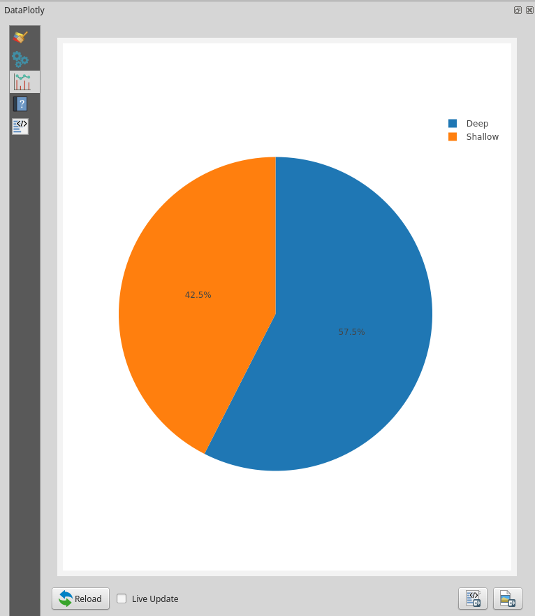
Plot Properties
Layer: the combobox will display all the vector layers loaded in QGIS
Grouping: features with the same value in the Grouping field are assigned
to the same pie segment
Y Field: the Y field determines the size of the pie segment. If features
are assigned to the same pie segment because they have the same value in the
Grouping field the corresponding values in the Y field are summed up to
determine the size of the pie segment. To create a pie chart displaying the
number of features belonging to each pie segment enter a 1 instead of a
field name
Marker color: the color used for filling the first pie segment. Subsequent
pie segments are filled using the default Plotly color scale.
To control the color of the individual pie segments use an expression yielding color strings depending on the value in the Grouping field.
For example, to create a pie chart showing the population in each continent using the Natural Earth ne_110m_admin_0_countries layer, choose CONTINENT as the Grouping field and POP_EST as the Y field. Then, to set the colors for the pie segments use the following expression in the Marker color field:
map_get(
  map(
    'Asia', '#8dd3c7',
    'Europe', '#ffffb3',
    'North America', '#bebada',
    'South America', '#fb8072',
    'Africa', '#80b1d3',
    'Oceania', '#fdb462',
    'Antarctica', '#b3de69',
    'Seven seas (open ocean)','#fccde5'
  ), "CONTINENT"
)
Plot Customizations
Show Legend: show the legend of the current plot
Legend Title: the title of the legend
Horizontal Legend: check if you want to have an horizontal legend