Data Plotly
Data Plotly is a python plugin for QGIS that allows the creation of D3 like plots thanks to the Plotly library and the python API.
Plots are totally dynamic so you can interact with the plot, e.g. zooming, getting some information hovering the mouse and many other useful stuff.
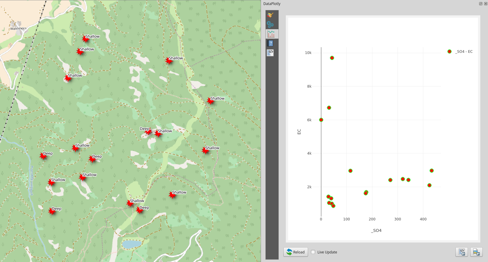
Moreover, plot and map canvas are connected, this mean you can select an object on the plot and the same object will be selected in the map:
Plot and Map interaction
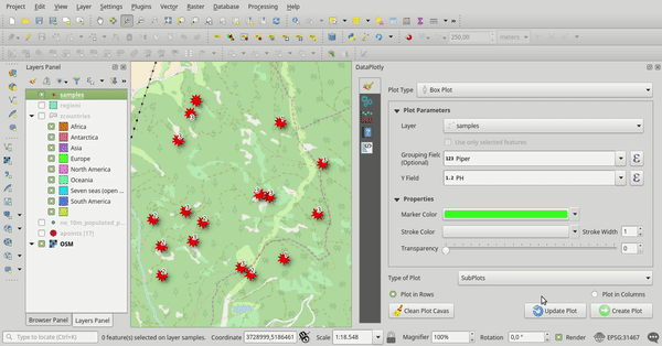
For each plot, tons of customizations are available.
simple plot example
With DataPlotly you can create different plots, even different plot types, overlay them in the same plot canvas or load them in different plot canvas:
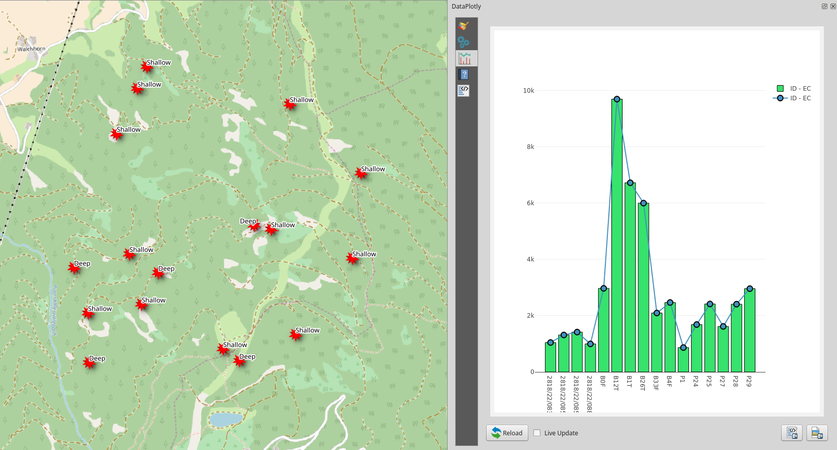
different plot types in the same map canvas
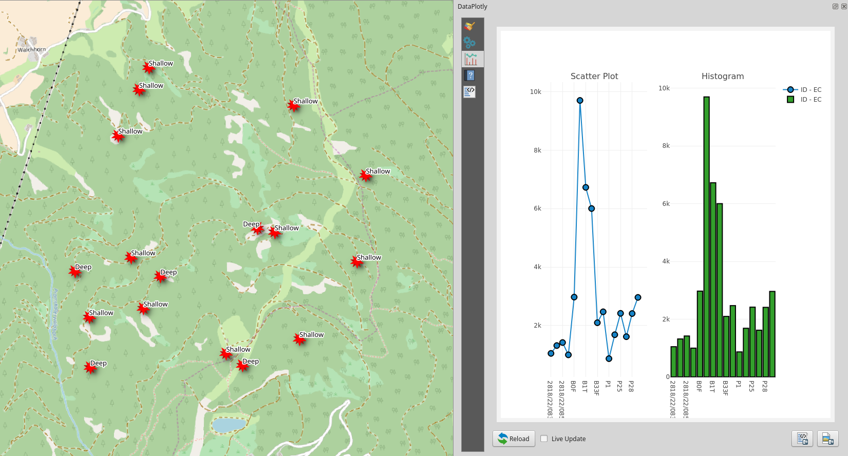
different plot types in separated plot canvas
Each plot type has its own configurations and customizations: it is very easy for you to choose the best solution that fits all your needs.
Besides the interactive plot canvas, plots can be exported as png static images or as pure html files. Html file keep the plot interactivity.
Finally, plot raw html code can be copied and pasted somewhere else, for example in html frame of the QGIS map composer or in an external website.
Plotly library javascript code is saved in the local plugin folder so the plugin is usable also without any Internet connection.